

Highway to the Danger Zone: US Dollar Edition
If only Maverick and Goose could bail us out of this one

Hello Decentralized Way subscribers!
No, your eyes don’t deceive you, it really is another edition of The Decentralized Way. Back after a long hiatus because bear markets are for building… And that is exactly what we’ve been doing.
Todays article is just 8 charts - Aimed at firing up your curiosity and providing a backdrop for all financial discussions to come when it comes to the United States and the dollar.
Keep an eye out for the year 1971 in these charts. Isn’t it funny that deficit spending really started to accelerate after about 1971 or so? What could have happened in 1971?
Hint: Nixon took the US off the gold standard, making the dollar backed by nothing and paving the way for uninhibited printing + devaluing. I’ve written about this before here and there, but more on this another time.
Let’s dive in on our way to the danger zone!
Chart 1 - The US Federal Surplus or Deficit
Below is a chart, showing the federal surplus (ha!) or deficit on a yearly basis.

If you have two eyes (even just one will do) you can clearly see that on a yearly basis, the deficit on a yearly basis has been accelerating to a now staggering $1.375 trillion dollars this year, down from a high of $3.132 trillion in 2020.
But back to the charts… The funny thing (or not so funny) about a deficit is that it’s cumulative and results in something called the Total National Debt. Meaning, all of these bars need to be added on top of each other to get a real picture of what the deficit actually looks like in total. That brings us to chart number two.
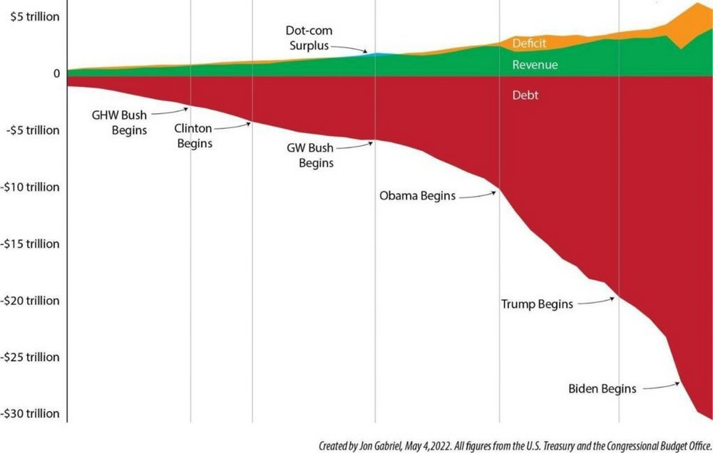
Chart 2 - Total National Debt
It’s a whopping $31,693,237,470,384. That’s over $31 trillion dollars. A truly unfathomable amount of money.

All of the bars in chart 1 add up to create the line above here in chart 2. The bigger the bars, the more this accelerates.
But if you’re doing the math, you’ll notice that all the bars in chart 1 do not add up to the line in chart 2. So where’s the extra debt coming from?
We’ve written about this before in the Four Horsemen of Government Debt but here’s the short version. It comes from interest expense.
When the Government borrows money, it must pay interest on the money it borrows. Simple enough right?
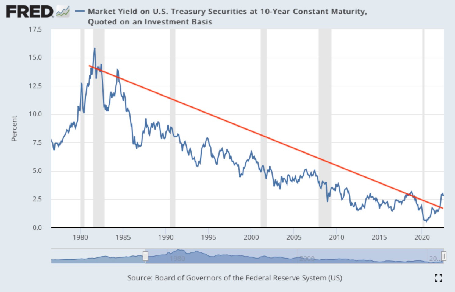
But a lot of the debt the Government has is sensitive to changes in interest rates. And for the last ~40 years, it has gotten cheaper and cheaper to borrow money. Until now.
As written in The Four Horsemen of Government Debt,
If you walk into your local grocery store and find that your favorite brand of tortilla chips are on sale, what do you do?
Well you load up of course! The more the merrier!
And if you walk in the next week and they’re even cheaper, what do you do?
Well you get more! You’ll eat them eventually, right?
And debtors do the same. Namely the biggest debtor of all, the US Government.
All of this to say that for the last ~40 years, loading up on debt wasn’t an issue. It was getting cheaper and cheaper to borrow all the way to 0%. But now, our crudely drawn red trend line on the chart above has broken, and rates are rising. It’s now far more costly to borrow than it used to be, and the US has WAY more debt than it used to have.
This all begs the question, how to fix it?
Charts 3, 4, and 5 - Fix it with Revenue?
Ah wouldn’t that be convenient.
Here’s a chart from the US treasury below. I find the side note quite humorous where I’ve highlighted. Source.

Congratulations - You spent $1.4 trillion dollars less that you don’t have & had to borrow than you did the previous year? Not really something I think deserves a pat on the back.
The bars show that the Government spent $1.38 trillion dollars that it didn’t have. Not great.
So how could the Government make these two bars even out? There’s 2 ways…
Spend less. Yeah right. There’s simply no incentive for any politicians to support initiatives that cut spending. Otherwise they’re seen as cutting jobs and being bad for business. This chart below of Government spending per year over time shows you what I mean. Source. Seen below these trillions of dollars spent only ever increases.

Raise taxes! Wait a minute, isn’t this already happening? From the Cato Institute below…
The budget proposes $4.7 trillion in tax increases on businesses and individuals, raising U.S. tax rates to some of the highest in the developed world. The budget’s projected revenues rise to 20.1 percent of GDP by 2033, 2.7 percentage points above the 50‐year average. All that tax revenue is still not enough to stabilize government debt as a share of the economy.
The 8 Biggest Tax Increases in Biden’s Budget, The Cato Institute, 3/9/2023. Source.
They’re also spending an awful lot on overhauling the IRS itself (see: $80 billion) and plan to hire 87,000 more IRS agents over the next decade. Source. The powers that be must think that money is worth spending…
But politicians are spending faster than money comes in, consistently!

Charts 6 & 7 - Highway to the Danger Zone!
Here’s where things get real unsettling. Allow me to share a quote with you below.
“Since 1800, 51 out of 52 countries that reached sovereign debt levels of 130% of GDP ended up “defaulting”, either through devaluation, inflation, restructuring, or outright nominal default, within a pretty wide spread of 0-15 years or so after that point.”
Ray Dalio, Principles For Navigating Big Debt Crises, 2021. Source.
So where is the US you ask? As of today, right at 120%. Source.
But you’ll see a spike in the chart. In Q2 2020, Debt to GDP hit 134.83%. Eclipsing Ray Dalio’s danger zone of 130%.

According to 2021 IMF data, the US has the 16th worst Debt to GDP ratio in the world. Source.
If you’re not a bit alarmed yet, maybe this next one will get you.
Chart 8 - The Blind Leading the Blind
This is a chart that was actually published by the US Treasury. Source - Page 10.
The US Treasury predicts that the Debt to GDP will reach 706% by 2096.

The proverbial ‘fat lady’ will sing before Debt to GDP gets to 706%. The system will break well before then. We’re already seeing cracks in it (see: bank failures) at current levels.
The powers that be know this but offer no real solutions. From the same report below.
The continuous rise of the debt-to-GDP ratio indicates that current fiscal policy is unsustainable.
- Department of the Treasury, Fiscal Year 2021 Annual Report. Source.
Is there any solution?
There’s no easy way out at this point. As we’ve been saying since the Decentralized Way launched in 2021, inflation (see: money printing/currency debasement) is the only path forward, no matter what the talking heads try to tell you. Buckle up!
And with that, we’ll see you in the next edition of the Decentralized Way.